
In today's episode we will step through how to implement your applications theme using Material UI's Theme Provider. We will configure everything from:
- Typography
- Breakpoints
- Colours
- Buttons
- How to scaffold your App
Let's get started!
Table of Contents:
- 🤔 What's a Theme?
- Theme Setup
- Typography
- Breakpoints
- Colour Palette
- Buttons
- Scaffold Your App
- 🙏 Closing
🤔 What's a Theme?
Themes are important as they define the look and feel of your overall application. A good theme engine will allow the development team to configure things once centrally, as opposed to repetitively.
The theme specifies the color of the components, darkness of the surfaces, level of shadow, appropriate opacity of ink elements, etc.
Themes let you apply a consistent tone to your app. It allows you to customize all design aspects of your project in order to meet the specific needs of your business or brand.
To promote greater consistency between apps, light and dark theme types are available to choose from. By default, components use the light theme type. (@material-ui)
Here's a good example where the Design Manager of GitHub, Diana Mounter, talks in depth about the struggles they had trying to make create a Dark theme and where creating a centralised theme earlier would have made their lives much easier.
When the design systems team at GitHub implemented their colour system in 2017 they were working with Sass, trying to wrangle thousands of disconnected colour values into something more manageable to use. Now they're revisiting colour again, but this time with new tools, new customer goals, and more experience. In the age of dark mode, can what they've learned from CSS-in-JS and component APIs help them in their approach to color themeability? In this talk Diana covers lessons in color systems, theming APIs, and a bit of color theory along the way.
Theme Setup
The first thing to do is wrap your Application with MUI's ThemeProvider component.
// src/app.tsx

import { CssBaseline, ThemeProvider } from '@material-ui/core';

export default function App() {
  return (
    <ThemeProvider> {/* Property 'theme' is missing... */}
      <CssBaseline />
      <h1>Design System</h1>
    </ThemeProvider>
  );
}
The above now wraps each of your app's child components with the Theme Provider, thus, exposing your theme via React's Context API, which we will later learn how to use.
Let's now create a new folder in your src directory called theme. Here is where we can store each of our theme configurations.
Create the following file:
// src/theme/index.tsx

import { createMuiTheme } from '@material-ui/core';

export default createMuiTheme({

})
The output of createMuiTheme will create a Theme object, which our newly added ThemeProvider Higher-order-Component (HoC) requires. Let's plug it in.
// src/app.tsx

import { CssBaseline, ThemeProvider } from '@material-ui/core';
import Theme from './theme';

export default function App() {
  return (
    <ThemeProvider theme={Theme}>
      <CssBaseline />
      <h1>Design System</h1>
    </ThemeProvider>
  );
}
Configure Theme
One of the really neat benefits of using MUI is that their TypeScript definitions are well documented. This is evident by using VSCode's "Go to definition" on any of their module exports for example if we dived into their createMuiTheme component, you will see something like this:
// node_modules/@material-ui/core/styles/createMuiTheme.d.ts

import { Breakpoints, BreakpointsOptions } from './createBreakpoints';
import { Mixins, MixinsOptions } from './createMixins';
import { Palette, PaletteOptions } from './createPalette';
import { Typography, TypographyOptions } from './createTypography';
import { Shadows } from './shadows';
import { Shape, ShapeOptions } from './shape';
import { Spacing, SpacingOptions } from './createSpacing';
import { Transitions, TransitionsOptions } from './transitions';
import { ZIndex, ZIndexOptions } from './zIndex';
import { Overrides } from './overrides';
import { ComponentsProps } from './props';

export type Direction = 'ltr' | 'rtl';

export interface ThemeOptions {
  shape?: ShapeOptions;
  breakpoints?: BreakpointsOptions;
  direction?: Direction;
  mixins?: MixinsOptions;
  overrides?: Overrides;
  palette?: PaletteOptions;
  props?: ComponentsProps;
  shadows?: Shadows;
  spacing?: SpacingOptions;
  transitions?: TransitionsOptions;
  typography?: TypographyOptions | ((palette: Palette) => TypographyOptions);
  zIndex?: ZIndexOptions;
  unstable_strictMode?: boolean;
}

export interface Theme {
  shape: Shape;
  breakpoints: Breakpoints;
  direction: Direction;
  mixins: Mixins;
  overrides?: Overrides;
  palette: Palette;
  props?: ComponentsProps;
  shadows: Shadows;
  spacing: Spacing;
  transitions: Transitions;
  typography: Typography;
  zIndex: ZIndex;
  unstable_strictMode?: boolean;
}

export default function createMuiTheme(options?: ThemeOptions, ...args: object[]): Theme;
We now know how to interface into this module and populate the ThemeOptions.
Typography
It's important to use the correct Typography for any given media, whether it be for Print, Digital, Low/High resolution devices.
Well defined typography should allow your viewers to clearly distinguish content and its formalities. For example, the font size of a H1 tag should be visually larger than that of a H2, likewise with H2 vs H3 and so on; this is called "Font Scaling". Find out more on the Type System.
Let's pick some fonts using Google Fonts, 1 bold for our headings and one other for the rest of our app.
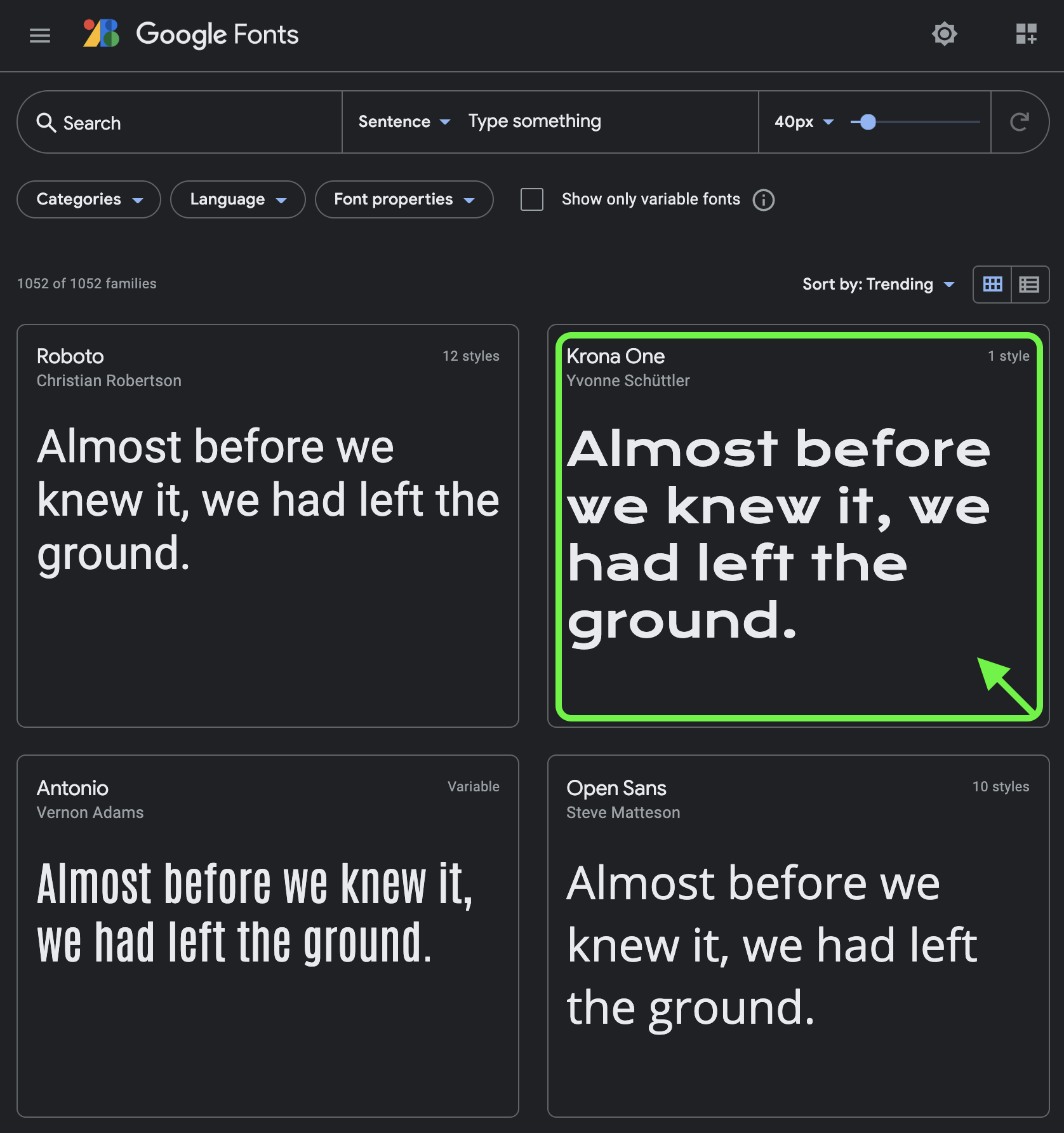
Step 1: Find your desired header font
Navigate through their font library until you find one you like (I'm happy with "Krona One"). Then click into the font's box to navigate and read more about the font's details.
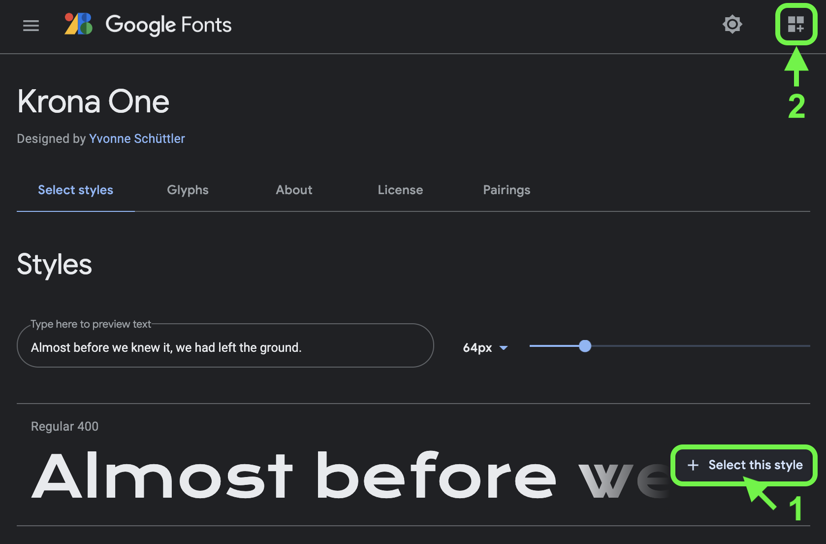
Step 2: Add the font to your "Selected families" tray
Proceeding with your font's selection, make sure to click "Select this style" to add it to your tray.
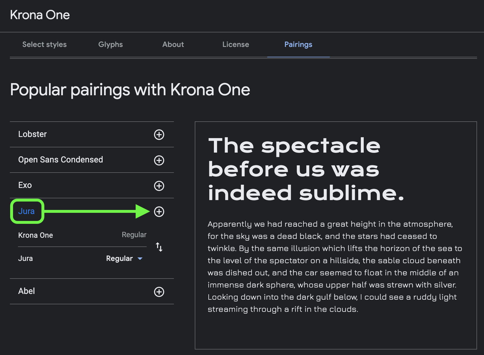
Step 3: Pair your font with one of their suggestions
A cool feature Google Fonts provide is that they give you a list of suggestive Pairings for your selected font. If none of the pairings work for you, go back to the home page and find another font. Once you are happy, make sure to add it to your tray.
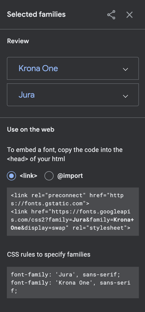
Step 4: Embed your fonts to your App
The "Selected families" tray will then allow you to review your selected fonts as well as present you how to embed them in your App. In this case I would use their proposed <link> implementation mostly because they provide the <link rek="preconnect"> line.
The
preconnectdeclaration helps improve page load speeds by instructing the browser to connect with another origin, thus hitting all of the connection constraints up front, rather then when the actual resource request gets called. Find out more.
Copy and paste their code snippet into the <head> block.
// public/index.html

<!DOCTYPE html>
<html lang="en">

<head>
  <meta charset="utf-8" />
  <meta name="description" content="Web site created using create-react-app" />
  <meta name="viewport" content="width=device-width, initial-scale=1" />
  <meta name="msapplication-TileColor" content="#231f20">
  <meta name="theme-color" content="#231f20">
  <link rel="apple-touch-icon" sizes="76x76" href="/apple-touch-icon.png">
  <link rel="icon" type="image/png" sizes="32x32" href="/favicon-32x32.png">
  <link rel="icon" type="image/png" sizes="16x16" href="/favicon-16x16.png">
  <link rel="manifest" href="/site.webmanifest">
  <link rel="mask-icon" href="/safari-pinned-tab.svg" color="#40bfb4">
  <link rel="preconnect" href="https://fonts.gstatic.com">
  <link href="https://fonts.googleapis.com/css2?family=Jura&family=Krona+One&display=swap" rel="stylesheet">
  <title>Design System | QuinTRON</title>
</head>

<body>
  <noscript>You need to enable JavaScript to run this app.</noscript>
  <div id="root"></div>
</body>

</html>
This instructs the browser to request our Google fonts during the App's initial load. The fonts themselves will only be apparent once we bind the CSS Font-Families to our HTML. To do this we'll need to extend our theme by adding a Typography configuration.
MUI's Typography component allow configuration for the following variants (I've added their default HTML element mapping as inline comments):
export type Variant =
  | 'h1'        // maps to <h1>
  | 'h2'        // maps to <h2>
  | 'h3'        // maps to <h3>
  | 'h4'        // maps to <h4>
  | 'h5'        // maps to <h5>
  | 'h6'        // maps to <h6>
  | 'subtitle1' // maps to <h6>
  | 'subtitle2' // maps to <h6>
  | 'body1'     // maps to <p>
  | 'body2'     // maps to <p>
  | 'caption'   // maps to <span>
  | 'button'    // maps to <button>
  | 'overline'; // maps to <span>
You can also change the default HTML mappings by implementing the following example:
// theme/index.tsx

const theme = createMuiTheme({
  props: {
    MuiTypography: {
      variantMapping: {
        body1: 'span', // traditionally set as <p>
        body2: 'span', // traditionally set as <p>
      }
    }
  }
});
⚠️
I highly recommend you read all of MUI's Typography definitions and rules for each of the Variants above. They do a good job in explaining how, when and where to use it in your App.
We can create our Typography file to configure each of the variants definitions.
// src/theme/typography.tsx

import { TypographyOptions } from '@material-ui/core/styles/createTypography';

export const typography: TypographyOptions = {
  h1:         { fontFamily: "'Krona One', sans-serif" },
  h2:         { fontFamily: "'Krona One', sans-serif" },
  h3:         { fontFamily: "'Krona One', sans-serif" },
  h4:         { fontFamily: "'Krona One', sans-serif" },
  h5:         { fontFamily: "'Krona One', sans-serif" },
  h6:         { fontFamily: "'Krona One', sans-serif" },
  subtitle1:  { fontFamily: "'Jura', sans-serif" },
  subtitle2:  { fontFamily: "'Jura', sans-serif" },
  body1:      { fontFamily: "'Jura', sans-serif" },
  body2:      { fontFamily: "'Jura', sans-serif" },
  caption:    { fontFamily: "'Jura', sans-serif" },
  button:     { fontFamily: "'Jura', sans-serif" },
  overline:   { fontFamily: "'Jura', sans-serif" },
}
Then add your Typography config to the Theme module.
// src/theme/index.tsx

import { createMuiTheme } from '@material-ui/core';
import { typography } from './typography';

export default createMuiTheme({
  typography
})
Your Google Font is now bound to MUI Typography components! Let's add some content to our App and test out how it looks.
// src/app.tsx

import { CssBaseline, ThemeProvider } from '@material-ui/core';

import Theme from './theme';

export default function App() {
  return (
    <ThemeProvider theme={Theme}>
      <CssBaseline />
      <h1>Heading 1</h1>
      <h2>Heading 2</h2>
      <h3>Heading 3</h3>
      <h4>Heading 4</h4>
      <h5>Heading 5</h5>
      <h6>Heading 6</h6>
      <p>Body content</p>
      <button>Button label</button>
      <caption>Caption text</caption>
    </ThemeProvider>
  );
}
This is what is looks like:
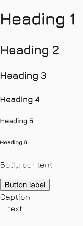
🤔 Hm, I don't see my header font. Ah-huh, it's because I was using the default HTML tags, not MUI's Typography component. Let's convert them like so:
// src/app.tsx

import { Button, CssBaseline, ThemeProvider, Typography } from '@material-ui/core';

import Theme from './theme';

export default function App() {
  return (
    <ThemeProvider theme={Theme}>
      <CssBaseline />
      <Typography variant="h1">Heading 1</Typography>
      <Typography variant="h2">Heading 2</Typography>
      <Typography variant="h3">Heading 3</Typography>
      <Typography variant="h4">Heading 4</Typography>
      <Typography variant="h5">Heading 5</Typography>
      <Typography variant="h6">Heading 6</Typography>
      <Typography variant="body1">Body content 1</Typography>
      <Typography variant="body2">Body content 2</Typography>
      <Typography variant="subtitle1">Subtitle 1</Typography>
      <Typography variant="subtitle2">Subtitle 2</Typography>
      <Typography variant="caption">Caption text</Typography>
      <Typography variant="overline">Overline text</Typography>
      <Button variant="contained">Button Contained</Button>
      <Button variant="outlined">Button Outlined</Button>
      <Button variant="text">Button Text</Button>
    </ThemeProvider>
  );
}
This is now what is looks like:
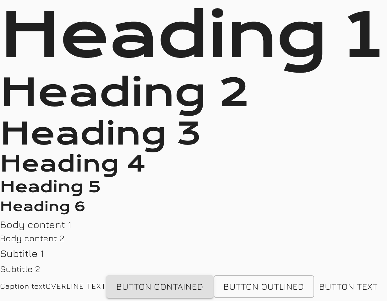
❤️ Now that's what the fonts should look like!
Type Scale
The next obvious step is to implement font scaling across all of our Typography set to provide consistency across the app, for all screen sizes and resolutions.
Font Sizing
Material-UI uses rem units for the font size. The browser
<html>element default font size is 16px, but browsers have an option to change this value, so rem units allow us to accommodate the user's settings, resulting in a better accessibility support. Users change font size settings for all kinds of reasons, from poor eyesight to choosing optimum settings for devices that can be vastly different in size and viewing distance.To change the font-size of Material-UI you can provide a fontSize property. The default value is 14px.
There are two ways to set your app's Font Sizing:
-
Manually declaring each of the variants font sizes, for each of your desired Break-Points in your Typography file. 😱
-
Using MUI's nifty
responsiveFontSizeshelper to do it for us! 🍾
For this example we will implement option 2 as it reduces the amount of custom code we need to maintain and defines all the font sizes for us for each breakpoint. An interactive demo on how this functionality works can be found here
All we have to do is wrap our theme with their function.
// theme/index.tsx

import { createMuiTheme, responsiveFontSizes } from '@material-ui/core';

import { typography } from './typography';

export default responsiveFontSizes(createMuiTheme({
  typography
}))
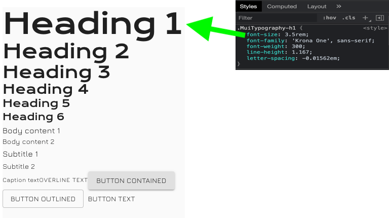
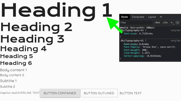
Our font sizes are now responsive! The following screenshots illustrate how the H1's font-size grows from mobile through to desktop, each configured against the small (sm), medium (md) and large (lg) breakpoints.
breakpoint:sm
breakpoint: md
breakpoint: lg
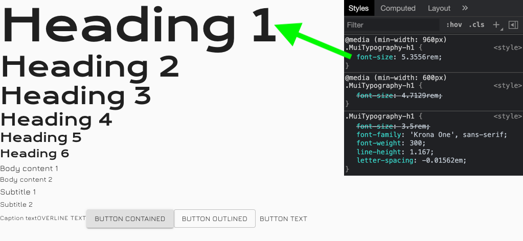
💡 MUI's design principle work off a Mobile-First approach, for example, the font-size style for Large breakpoint overrides that of the Medium and Small (default) font-sizes.
If you wish to change the strength of the font size's resize amount between breakpoints, you can add a factor option to the responsiveFontSizes function.
// theme/index.tsx

import { createMuiTheme, responsiveFontSizes } from '@material-ui/core';

import { typography } from './typography';

export default responsiveFontSizes(createMuiTheme({
  typography
}), {
  factor: 1 // [default is 2] The higher the value, the less difference there is between font sizes on small screens. The lower the value, the bigger font sizes for small screens. The value must be greater than 1.
})
Breakpoints
For optimal user experience, material design interfaces need to be able to adapt their layout at various breakpoints. Material-UI uses a simplified implementation of the original specification.
The breakpoints are used internally in various components to make them responsive, but you can also take advantage of them for controlling the layout of your application through the Grid and Hidden components.
Configuration
MUI's Theme implements the following default breakpoints:
- xs, extra-small: 0px
- sm, small: 600px
- md, medium: 960px
- lg, large: 1280px
- xl, extra-large: 1920px
I've personally never had to change any of the Breakpoint settings even though you are able to reconfigure them.
Information on how to customize Breakpoints can be found here.
📝
Take mental note of the breakpoint keys [
xs,sm,md,lg,xl] as you will use them in the future.
Accessing Breakpoints
When you get to the stage of developing components you'll eventually have to solve responsive layout issues to make your App accessible and as fluid as possible.
MUI offer many ways for you to interface into the Theme's breakpoint state whether you wish to statically style your component and its breakpoint changes, or observe breakpoint changes in your Component to logically do something. Let's go through some examples.
CSS Media Queries
For this example imagine you have a Card component which has a heading, some text and then a call-to-action Button at the bottom. You are then tasked to style the Button against different breakpoints.
Pseudo train of thought
- [breakpoints equal to or less than
sm] the button should span across the full width of the card, - [breakpoints equal to or greater than
md] the button should anchor to the right using its original width. - [breakpoints equal to or greater than
lg] the button should anchor to the right using its original width, and its padding should be larger.
Final implemtation
// Example: CSS Media Queries

const styles = theme => ({
  button: {
    [theme.breakpoints.down('sm')]: {
      width: '100%'
    },
    [theme.breakpoints.up('md')]: {
      width: 'auto'
    },
    [theme.breakpoints.up('lg')]: {
      paddingLeft: '4rem',
      paddingRight: '4rem'
    },
  },
});
Few things to note:
breakpointsis a property exposed from our injectedtheme(via theThemeProviderHoC)breakpointshave 4 functions you can use to select your target breakpoints:
- theme.breakpoints.up(key)
- theme.breakpoints.down(key)
- theme.breakpoints.only(key)
- theme.breakpoints.between(start, end)
- Declare your breakpoints from smallest to largest as to retain MUI's Mobile-First design principle. By not doing this you could experience unexpected behavior.
JS Media Queries
For this example imagine you have a Table which has many columns and is read from left to right. This table reads really well on larger screens however the designer has rejigged the Table for mobile screens, thus a second rendition of the Table should be rendered in this case.
Pseudo train of thought
- [breakpoints equal to or less than
sm] should render theMobileTable, otherwise theLargerTableshould be rendered.
Final implementation
// Example: JS Media Queries

import { useTheme } from '@material-ui/core/styles';
import useMediaQuery from '@material-ui/core/useMediaQuery';

function TableWrapper() {
  const theme = useTheme();
  const mobileBreakpoint = useMediaQuery(theme.breakpoints.down('sm'));

  if (mobileBreakpoint) {
    return <MobileTable />
  }
  return <LargerTable />
}
Few things to note:
- The
useThemehook is defined so theTableWrappercomponent has access to the app'sTheme. - The
useMediaQueryhook is defined and parameterized with my desired breakpoint for the hook to observe. Its initial value is eithertrueorfalse, depending on the clients calculated dimensions. useMediaQueryobserve the windows Resize event and will internally recompute the hooks value if the theme's current breakpoint value changes.- Remember
breakpoints.down(key),breakpoints.up(key)includes thekeyas part of its Boolean check.
Colour Palette
Colour exists and most are fortunate to witness its array and uses in the world. If used well it can promote your brand and cognitively remind people of your brand, it can indicate a level of severity and attract the eye. Ultimately colour has meaning.
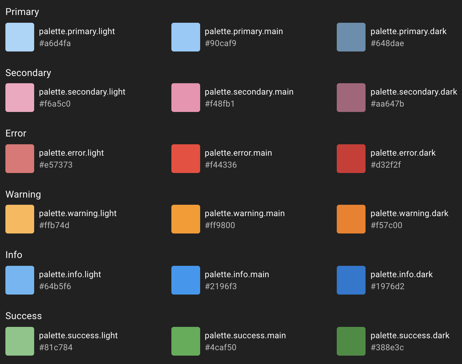
MUI's Theme allow you to configure a palette, which is a make up "colour intention". Here are the colour intentions and their uses.
- primary - used to represent primary interface elements for a user. It's the colour displayed most frequently across your app's screens and components.
- secondary - used to represent secondary interface elements for a user. It provides more ways to accent and distinguish your product. Having it is optional.
- error - used to represent interface elements that the user should be made aware of.
- warning - used to represent potentially dangerous actions or important messages.
- info - used to present information to the user that is neutral and not necessarily important.
- success - used to indicate the successful completion of an action that a user triggered. If you want to learn more about colour, you can check out the colour section.
The following screenshot shows each colour intention and their default values:
Choosing Your Colours
MUI's the gift which just keeps giving! The Material Design team have built a "Color Tool" which you can use to plug in your specific colours and visually see them against MUI's base components. The tool also has an Accessibility feature which I encourage you to use as it will report the legibility of your colours.
I will continue to use the Mechanical Rock brand colours:
- Primary: #40BFB4
- Secondary #E15554
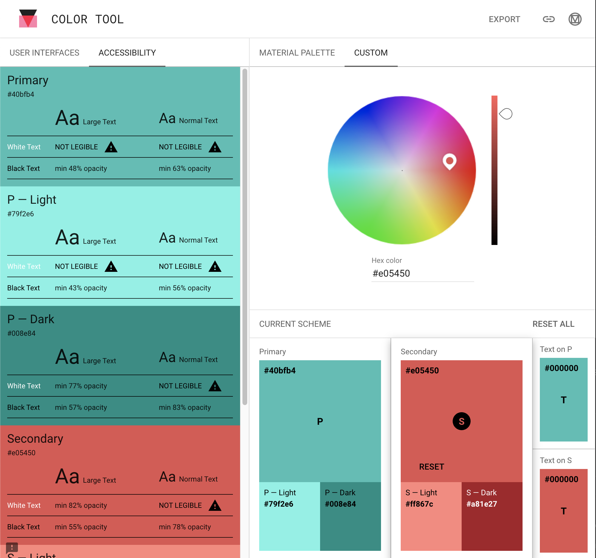
The tool will automatically calculate the Light and Dark values from your provided main colour.
🤔
The Accessibility report suggests "White Text" on each of my Primary variants are not legible; the same is mostly true for the Secondary variants. Remind yourself of this in future.
Apply the Palette
Once you have finalized your Primary and Secondary colours you can then configure them into your Theme. We will create a new Palette file to manage this change (like we did for Typography).
// theme/palette.tsx

import { PaletteOptions } from '@material-ui/core/styles/createPalette';

export const palette: PaletteOptions = {
  primary: {
    // light: will be calculated from palette.primary.main,
    main: '#40bfb4',
    // dark: will be calculated from palette.primary.main,
    // contrastText: will be calculated to contrast with palette.primary.main
  },
  secondary: {
    // light: will be calculated from palette.primary.main,
    main: '#e05450',
    // dark: will be calculated from palette.secondary.main,
  },
  // Used by `getContrastText()` to maximize the contrast between
  // the background and the text.
  contrastThreshold: 3,
  // Used by the functions below to shift a color's luminance by approximately
  // two indexes within its tonal palette.
  // E.g., shift from Red 500 to Red 300 or Red 700.
  tonalOffset: 0.2,
}
And replace the default palette of MUI with our newly created palette, through our theme file.
// theme/index.tsx

import { createMuiTheme, responsiveFontSizes } from '@material-ui/core';

import { typography } from './typography';

export default responsiveFontSizes(createMuiTheme({
  typography,
  palette
}))
As the comments in the above code snippet suggest, you can let MUI calculate the Light/Dark values for you for free, otherwise manually add them for each Primary and Secondary objects.
Even if your chosen colours have been reported eligible in the "Color Tool" there is still a chance your foreground text does not contrast well against background shades on your surfaces. The contrastThreshold property allows you to amplify or soften the contrast of your text against the background colour.
If you wish to dim the lights or make a colour more vivid during events such as hovering over a button, you can tweak the amount against the tonalOffset property.
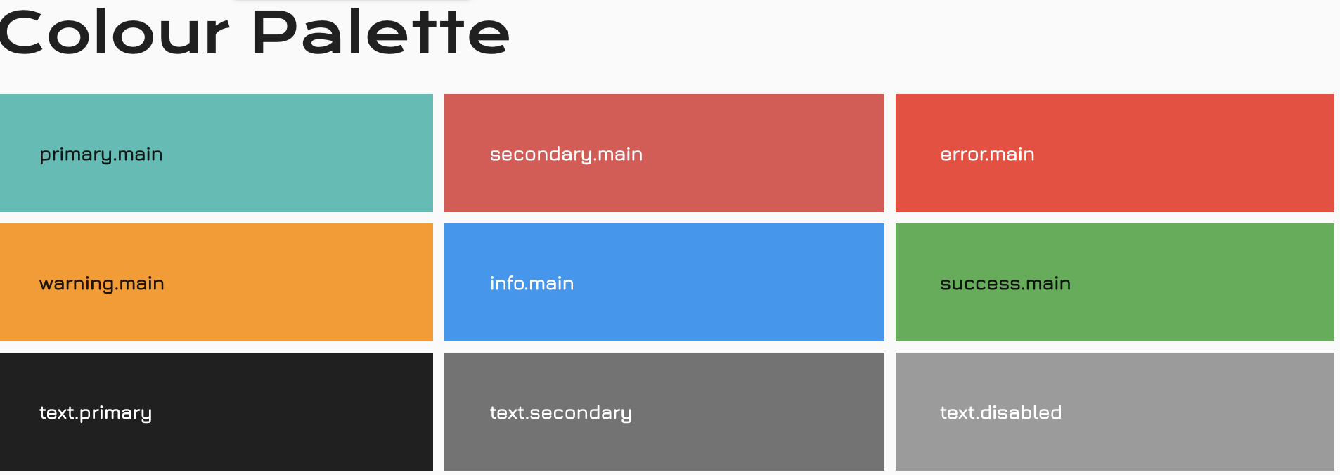
Let's add a colour section to our App by doing the following:
// src/ui/ColourPalette/index.tsx

import React from 'react';

import { Box, Grid, Typography } from '@material-ui/core';

function ColourBox({ intention, variant }: { intention: string; variant: string; }) {
  const bgColor = `${intention}.${variant}`;
  const color = intention === 'text' ? 'background.paper' : `${intention}.contrastText`;
  return (
    <Grid item xs={12} sm={4}>
      <Box bgcolor={bgColor} color={color} p={4}>
        <strong>{bgColor}</strong>
      </Box>
    </Grid>
  )
}

const palette = [
  { intention: 'primary', variant: 'main' },
  { intention: 'secondary', variant: 'main' },
  { intention: 'error', variant: 'main' },
  { intention: 'warning', variant: 'main' },
  { intention: 'info', variant: 'main' },
  { intention: 'success', variant: 'main' },
  { intention: 'text', variant: 'primary' },
  { intention: 'text', variant: 'secondary' },
  { intention: 'text', variant: 'disabled' }
]
export default function ColourPalette() {
  return (
    <>
      <Typography variant="h2">Colour Palette</Typography>

      <Grid container spacing={1}>
        {palette.map((p, i) => <ColourBox key={i} {...p} />)}
      </Grid>
    </>
  )
}
Then add the new section to our App:
// src/app.tsx

import { CssBaseline, Divider, ThemeProvider } from '@material-ui/core';

import Theme from './theme';
import ColourPalette from './ui/ColourPalette';
import Typography from './ui/Typographies';

export default function App() {
  return (
    <ThemeProvider theme={Theme}>
      <CssBaseline />
      <Typography />
      <Divider />
      <ColourPalette />
    </ThemeProvider>
  );
}
You should end up seeing this:
Buttons
Buttons allow users to take actions, and make choices, with a single tap. (@material-ui)
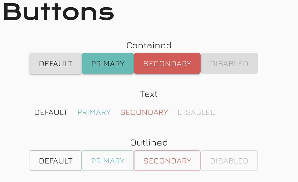
MUI offer 3 variations of buttons, Contained, Text, Outlined.
Contained Button
Contain buttons should be used for primary user actions. They are pronounced and elevated on the surface.
Text Button
Text buttons are typically used for less-pronounced actions, including those located in Dialogs and Cards. In cards, text buttons help maintain an emphasis on card content.
Outlined Button
Outlined buttons are medium-emphasis buttons. They contain actions that are important, but aren’t the primary action in an app. Outlined buttons are also a lower emphasis alternative to contained buttons, or a higher emphasis alternative to text buttons.
Let's add a button section to our App by doing the following:
// ui/Buttons/index.tsx

import React from 'react';

import { Button, Container, Typography } from '@material-ui/core';

export default function Buttons() {
  return (
    <>
      <Typography variant="h2">Buttons</Typography>


      <Container maxWidth="xs">
        <Typography variant="subtitle1" align="center">Contained</Typography>
        <Button variant="contained" color="default">Default</Button>
        <Button variant="contained" color="primary">Primary</Button>
        <Button variant="contained" color="secondary">Secondary</Button>
        <Button variant="contained" color="primary" disabled>Disabled</Button>
      </Container>


      <Container maxWidth="xs">
        <Typography variant="subtitle1" align="center">Text</Typography>
        <Button variant="text" color="default">Default</Button>
        <Button variant="text" color="primary">Primary</Button>
        <Button variant="text" color="secondary">Secondary</Button>
        <Button variant="text" color="primary" disabled>Disabled</Button>
      </Container>


      <Container maxWidth="xs">
        <Typography variant="subtitle1" align="center">Outlined</Typography>
        <Button variant="outlined" color="default">Default</Button>
        <Button variant="outlined" color="primary">Primary</Button>
        <Button variant="outlined" color="secondary">Secondary</Button>
        <Button variant="outlined" color="primary" disabled>Disabled</Button>
      </Container>
    </>
  )
}
Don't forget to add it to your App.tsx file to see the new content!
We should see something like this:
Scaffold Your App
Setting your app's initial layout can be daunting. Even though most website layouts are quite consistent these days, there is more than 1 way to skin a cat! Too many website implementations lack well schematic HTML, making me think there is a gap of knowledge on this subject. For example websites which have multiple H1 tags, broken header hierarchy, unnecessary div usage which should be replaced with better purposed tags.
👍 Our goal as Front-End developers is to make everything we build accessible!
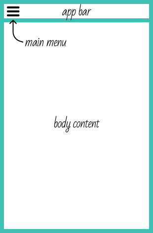
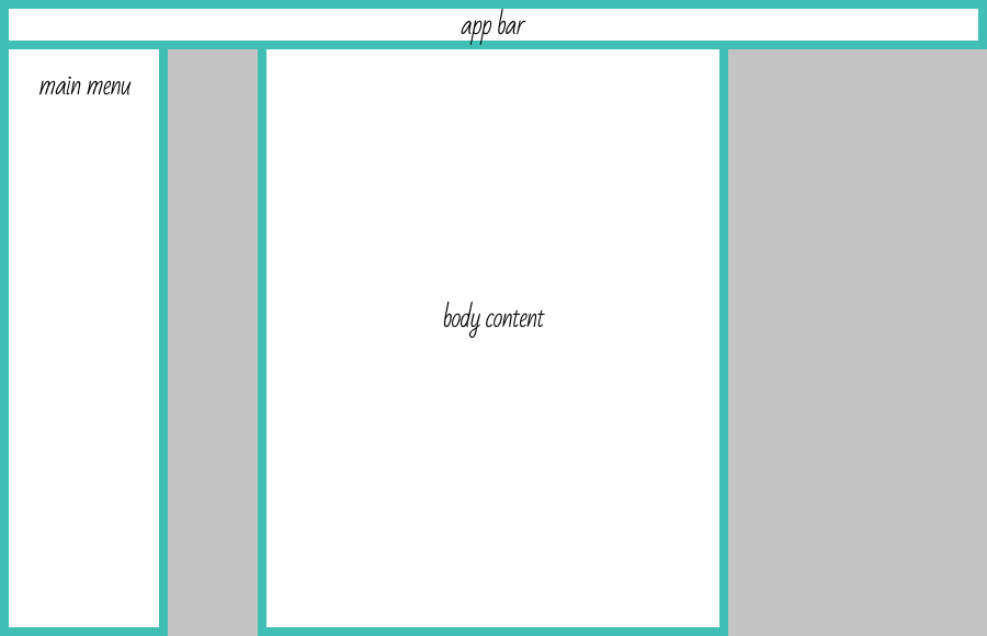
Before we can start building out our layout we need to know where the main landmarks are. Will the main menu navigation be on the top of the page (will it be fixed?), or will it be anchored on the left of the page? What type of content are you required to display? Blog-like content where content is best presented in the center channel or multimedia, where content can be tiled.
For our case the scaffold will look like this for mobile:
And for desktop:
App Bar
The App Bar displays information and actions relating to the current screen. It provides content and actions related to the current screen. It’s used for branding, screen titles, navigation, and actions.
Create a new file to manage your App Bar:
// src/components/AppBar/index.tsx

import React from 'react';

import { AppBar as MuiAppBar, IconButton, Toolbar, Typography } from '@material-ui/core';
import { MenuRounded } from '@material-ui/icons';

export default function AppBar() {
  return (
    <MuiAppBar color="primary" position="sticky">
      <Toolbar>
        <IconButton edge="start" aria-label="menu">
          <MenuRounded />
        </IconButton>
        <Typography variant="h6">
          Component Library
        </Typography>
      </Toolbar>
    </MuiAppBar>
  )
}
Few things to note:
- We have to cast the imported
AppBarmodule to a new nameMuiAppBarso that we are able to export our own version of theAppBargoing forward. - We implement the
[position="sticky"]prop against theMuiAppBar. This is so the AppBar will stick to the top of the viewport, even when you scroll beyond its initial position. - We implement the
[edge="start"]prop against theIconButton. This will apply some css to anchor the icon to the left, minus its original margin offset.
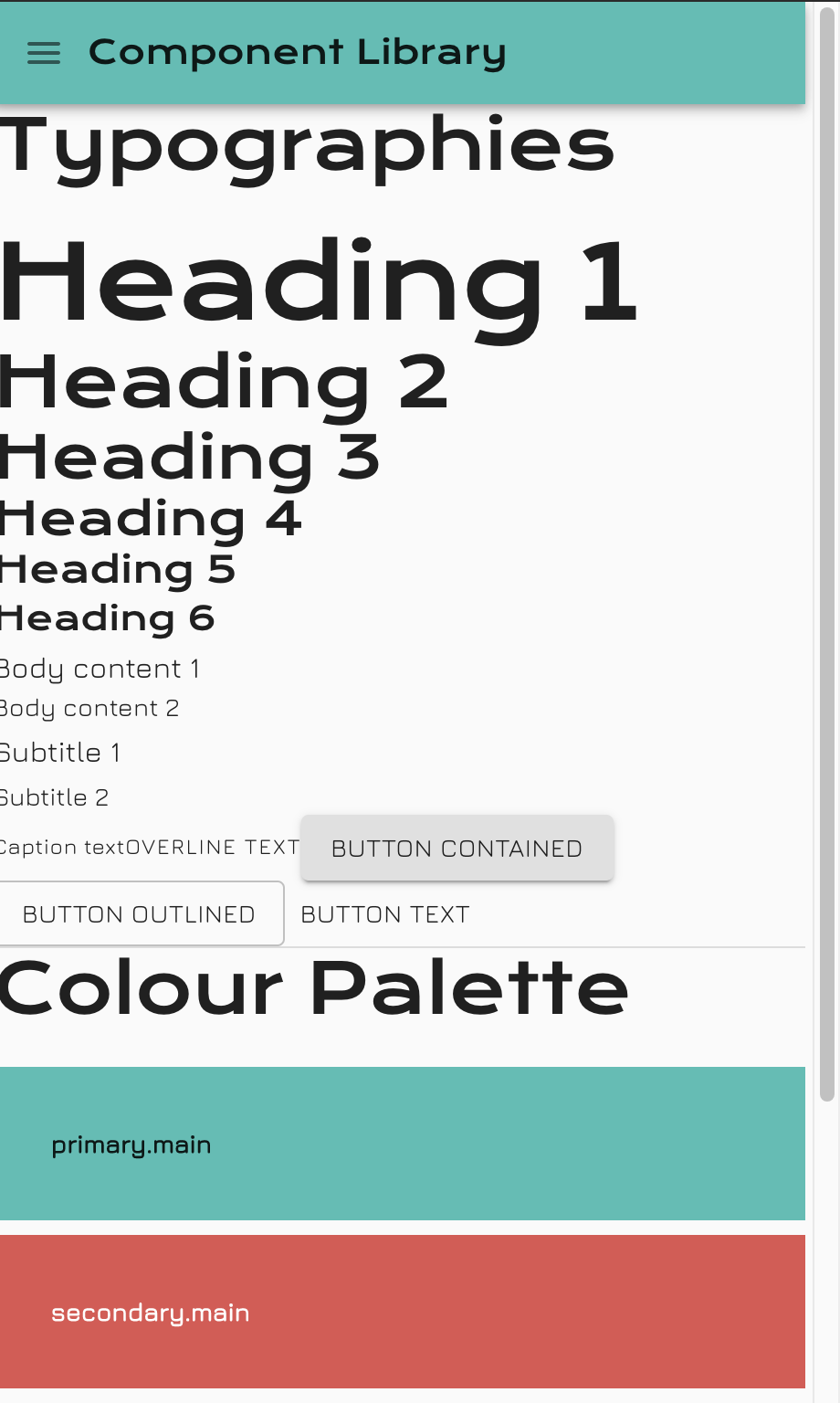
We end up with this:
Body Content
Here is where most of your audience will spend their time discovering, interacting or researching for information in your App. The body content itself can obtain many layouts internally, but what's important its abstract layer should be consistent.
Create a new file to manage your Body Content:
// src/components/BodyContent/index.tsx

import React from 'react';

import { Divider, makeStyles } from '@material-ui/core';

import ColourPalette from '../../ui/ColourPalette';
import Typographies from '../../ui/Typographies';

const useStyles = makeStyles(() => ({
  root: {
    margin: '0 auto',
    maxWidth: '57rem',
    padding: '2rem 0'
  }
}))

export default function BodyContent() {
  const classes = useStyles();

  return (
    <main className={classes.root}>
      <Typographies />
      <Divider />
      <ColourPalette />
    </main>
  )
}
Few things to note:
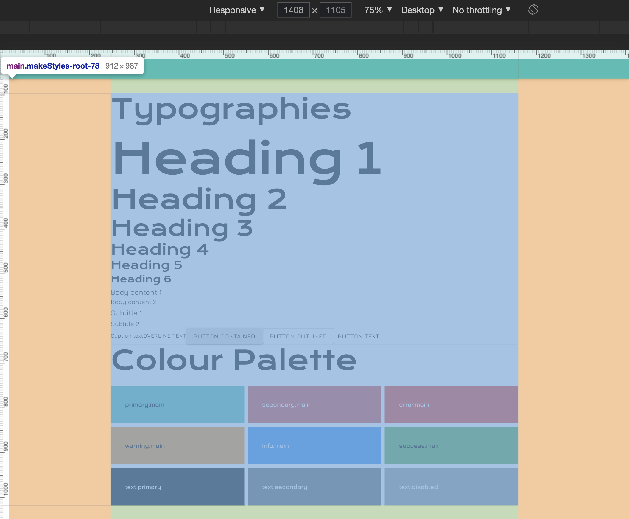
- We've created our first CSS-in-JSS example. We had to do this to define some styles against the root element of this component,
<main>.makeStylesexport the computed styles as a hook, when we've assigned to a scoped variable nameduseStyles.useStylesis then declared inside the body of ourBodyContentcomponent so we have access to it. margin: '0 auto'will make sure the<main>block is centered in the pagemaxWidth: '57rem'will set the maximum width of the<main>block, I felt represented a good readable column width for larger screens.padding: '2rem 0'will apply a consistent 2rem gutter at the top and bottom of the<main>block.- We've since migrated the Typographies and ColourPalette components from the
app.tsxfile into this file. - Note the use of the HTML
mainTag. It's a more accurate tag to use in this case as it encapsulates the intent for the rest of the content.
Here's a desktop screenshot of showing the box-model of our <main> element:
Main Menu Navigation
The main menu is the primary way for users to navigate around your App. It should contain all the main areas of the App and indicate where the user currently sits in the hierarchy.
Create a new file to manage your Main Menu Navigation:
// src/components/MainMenu/index.tsx

import React from 'react';

import { Drawer, List, ListItem, ListItemText } from '@material-ui/core';

function MenuItems() {
  return (
    <List>
      {['1', '2', '3'].map(item => (
        <ListItem button key={item}>
          <ListItemText primary={`Menu Item #${item}`} />
        </ListItem>
      ))}
    </List>
  )
}

type Props = {
  openMenu: boolean;
  setOpenMenu: React.Dispatch<React.SetStateAction<boolean>>;
}

export default function MainMenu({ openMenu, setOpenMenu }: Props) {
  return (
    <nav aria-label="main menu navigation">
      <Drawer
        anchor="left"
        disablePortal
        onClose={() => setOpenMenu(false)}
        open={openMenu}
        variant="temporary"
      >
        <MenuItems />
      </Drawer>
    </nav>
  );
}
Few things to note:
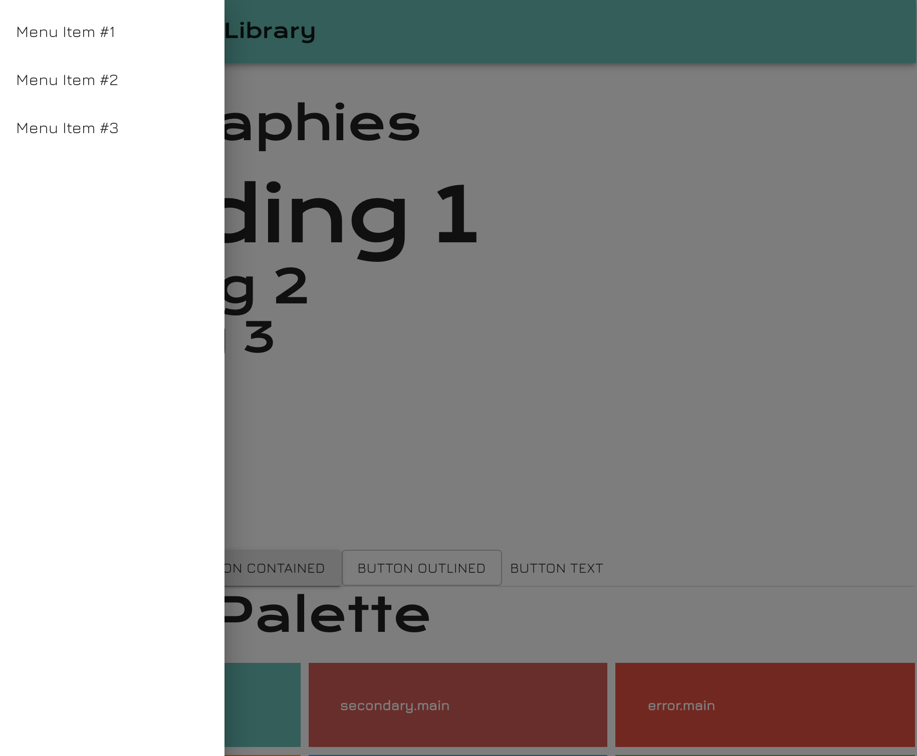
- We're using MUI's
Drawercomponent to hold our Menu Items content. [anchor="left"]prop is used to declare where we would like the Menu it transition from.- I've personally declared
[disablePortal=true]here so the HTML lives inside of the<nav>element, thus, making it more accessible and schematically correct. - The
onClosecallback function gets invoked only if the background click-away-listener is present; set by the[variant="temporary"]property. [open=true]will transition the Menu in and the opposite will transition the Menu out.
We then have to colocate the MainMenu with our AppBar component as it has the Menu button we need to wire up.
// src/components/AppBar/index.tsx

import React from 'react';

import { AppBar as MuiAppBar, IconButton, Toolbar, Typography } from '@material-ui/core';
import { MenuRounded } from '@material-ui/icons';

import MainMenu from '../MainMenu';

export default function AppBar() {
  const [openMenu, setOpenMenu] = React.useState(false);

  return (
    <>
      <MuiAppBar color="primary" position="sticky">
        <Toolbar>
          <IconButton
            edge="start"
            aria-label="menu"
            onClick={() => setOpenMenu(state => !state)}
          >
            <MenuRounded />
          </IconButton>
          <Typography variant="h6">
            Component Library
          </Typography>
        </Toolbar>
      </MuiAppBar>
      <MainMenu openMenu={openMenu} setOpenMenu={setOpenMenu} />
    </>
  )
}
💡 We can better manage this type of state using React's Contextual API. This will be covered in a future episode.
We end up with this:
🙏 Closing
At this stage your application should be wrapped with a Theme Provider. You should have enough knowledge on how to override the styles of MUI components as well as how to create your own styles along side your own components.
You are now ready to move onto the next episode where I’ll be walking you through how to implement Routing in your app, covering the following topics:
- How to setup Routing in your app,
- Routes with parameters,
- Route hooks,
- Route transitions
Don't be shy, get in touch with us!
